
Bauhaus Trinity Rewoven: Anni and Josef Albers Join Paul Klee at Zwirner

A viewer considers Anni Albers' "Wallhanging" (1924), which “radiates the Bauhaus ethos with subversive elegance.” Photo by Lisa Freeman.
In a powerful move that feels perfectly timed for our current modernist obsession, David Zwirner has dropped "Affinities," a three-artist dialogue that's been hiding in plain sight for a century. Curated by Nicholas Fox Weber, the exhibition brings together the trifecta of Anni Albers, Josef Albers, and Paul Klee—Bauhaus legends who shared walls in Weimar and Dessau and now share them again at 537 West 20th.
“Neither Paul Klee nor Anni nor Josef imitated one another, but they shared certain goals,” Fox Weber, an art historian, author and executive director of the Josef and Anni Albers Foundation, wrote in a curator’s statement. “Their art was a celebration—of color, of form, of the value of art that was not a personal revelation but was, rather, an ode to the universal. This exhibition has been created to unite the work of these three timeless artists and to reveal the rich affinities of work that is salubrious and uplifting,” he wrote.
Among the highlights: Anni Albers' "Wallhanging" (1924) radiates the Bauhaus ethos with subversive elegance. The textile's horizontal bands in earth tones—varying browns and beiges—create a rhythm that's deceptively simple yet mathematically precise. This textile masterclass shows why she was never just "Josef's wife" but rather the revolutionary who dragged weaving from craft into high art. The weaving technique reveals her technical virtuosity while maintaining a modernist restraint that vibrates with quiet defiance.

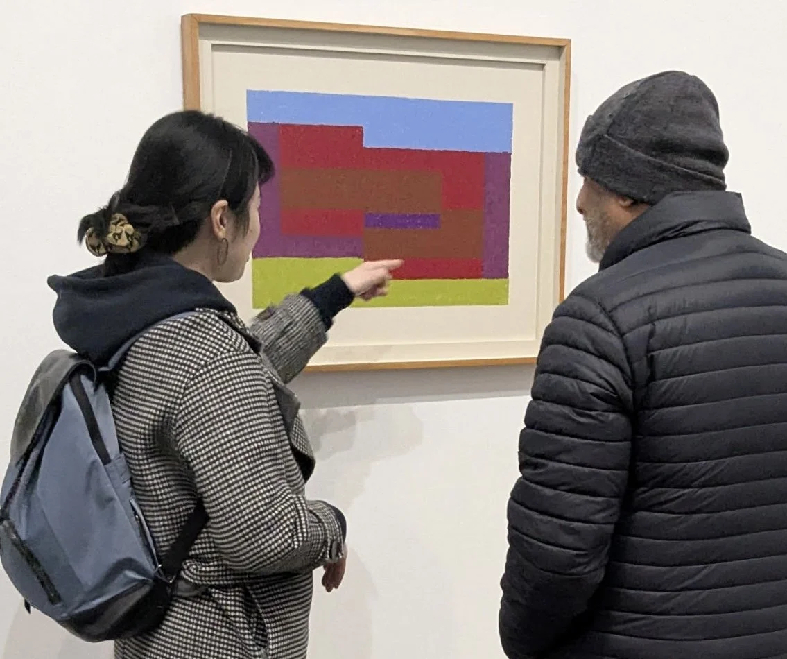
Josef's "Gitterbild (Grid Mounted)" (c. 1921-1922) “sits like a color bomb from the early Bauhaus era.” Photo by Lisa Freeman.
Meanwhile, Josef's "Gitterbild (Grid Mounted)" (c. 1921-1922) sits like a color bomb from the early Bauhaus era. This stained glass grid—one of his rare surviving works from the period—explodes with chromatic cells arranged in methodical yet seemingly random patterns. Blues, greens, ambers, and grays transform mundane industrial materials into transcendent light-catchers. Before his famous "Homage to the Square" series, here's Josef working out his lifelong obsession with color relationships through a completely different medium.

Klee's "Garten Stillleben" (Garden Still Life) from 1924 with its dreamlike geometry. Photo by Lisa Freeman.
Klee's "Garten Stillleben" (Garden Still Life) from 1924 completes this visual conversation with its dreamlike geometry. Red-brown borders frame a composition where circles, triangles, and squares float like half-remembered garden objects. This is Klee's signature move—geometric abstraction that somehow feels organic, mathematical yet whimsical. Those little Xs and circles might be flowers or fruits, but they're also just shapes playing in space.
What's remarkable is how these three never copied each other, yet were clearly breathing the same air. As Weber notes in the exhibition materials, they shared "the value of art that was not a personal revelation but was, rather, an ode to the universal." Their visual languages developed in parallel tracks—Anni's systematic textiles, Josef's color investigations, and Klee's poetic geometry all speaking to that quintessential Bauhaus dream of finding universal visual principles.
Josef Albers, To Mitla, 1940. Photo by Lisa Freeman.
This show is more than a history lesson—it's a rare chance to witness an artistic ecosystem that changed everything. The work feels shockingly fresh nearly a century later, like it was made yesterday in some Brooklyn warehouse rather than in interwar Germany. Modernism's radical heartbeat is still pumping through these pieces, reminding us why this aesthetic revolution continues to reverberate through contemporary design.
Get there before it closes, especially ahead of the upcoming Anni Albers deep dive at Zentrum Paul Klee in November 2025 and "Woven Histories" at MoMA next month. This is the Bauhaus dream team in their element—playful, profound, and perpetually ahead of their time.